Creating My Logo
Logos are interesting design challenges. Years ago another artist said to me that a logo “must look as good on a billboard as it does on a stamp.” Being primarily an abstract painter, a logo does utilize a different wave-length, but the art of it is still pressingly apparent.
I chose Diane’s Paintings as a business name, simply because it was already my website URL and simple to remember. I thought people may not “find” me as my last name “Smyres” has a slightly counter-intuitive spelling. It’s pronounced like My-ERS…but what’s with the “R-E-S”?
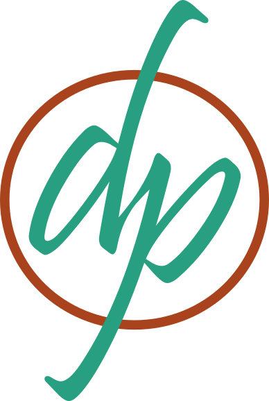
So Diane’s Paintings needed a simple, clean, “dp” logo.
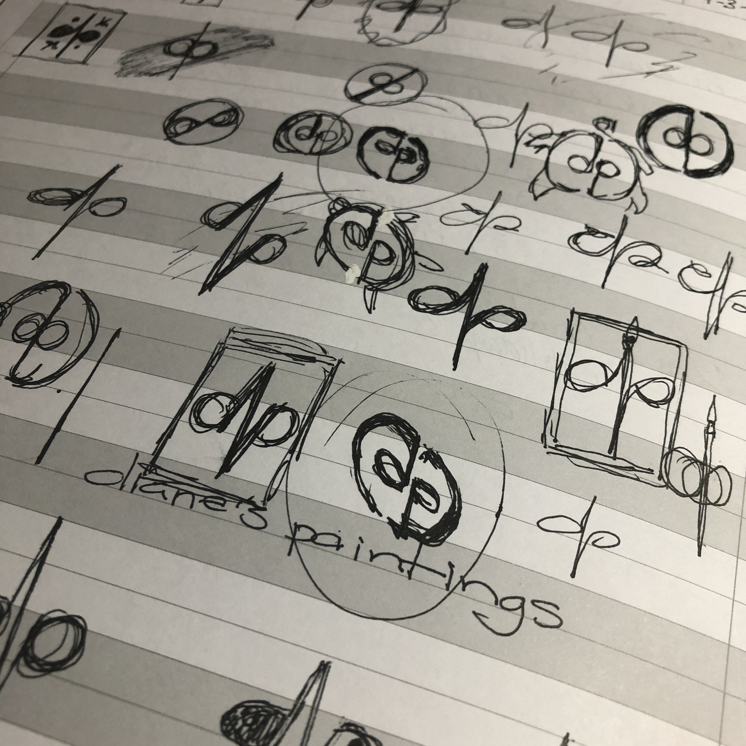
There are elements I consciously wanted to incorporate: A sense of symmetry, balance. I’ve been quite compelled by larger themes of balance in nature as it pertains to Chaos and Order. This lead to an idea of the yin/yang concept being an element to consider. I brainstormed and doodled my way through a lot of ideas (see ink drawings). One thing I quickly realized was that a “d” and a “p” are inverted versions of each other. Creating an ambigram appealed to my sense of symmetry greatly.
The hollows of each letter, lined up next to each other, also have the positive and negative spaces that create the impression of a yin/yang symbol if the fields were to be filled in with opposite colors.
Little by little the logo evolved, encapsulating many of the ideas (ideals?) that I hold to in my life.


